Pantone is known for devising an ingenious system of codifying colours in order to maintain uniformity across the textile and print design industries. According to its website, Pantone is concerned with studying how colour influences human thoughts, emotions and physical reactions endeavouring to provide experts with a deeper understanding of colour to facilitate its use in design and consumerism more effectively. Therefore it is not surprising that what it is most famous for is for making the annual forecast of what colour will be trending in the coming 365 days. And it is the moment that interior designers and related cognoscenti expectantly wait for – the Pantone Colour of the Year. And this year’s proclaimed Pantone Colour is ultraviolet.
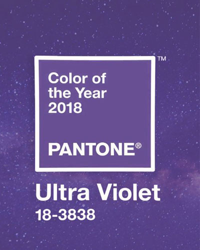
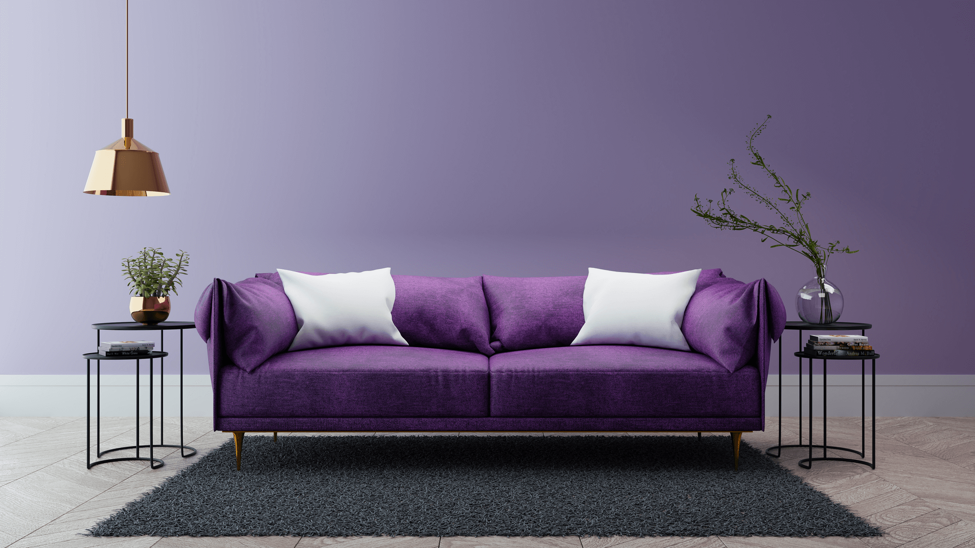
The Pantone Colour of the Year is a characteristic hue that takes inspiration from previous years and sets the tone for what is to be expected in the following year. Choosing ultraviolet as the Pantone Colour of the Year 2018 is invigorating. Considering that most people use the colours violet and purple interchangeably and that we will be seeing a whole lot of violet this year, it is perhaps important to understand the difference between the two colours. Ultraviolet is a deeper colour with more blue tones; it is on the cooler end of the electromagnetic spectrum, whilst purple has more red in its constitution as it is made from two spectral colours blue and red.
Ultraviolet, technically known as Pantone 18-3838, is a colour that exudes enough spirituality and mysticism that it ricochets through your entire body. It can be best expressed as a celestial shade of purple; the colour we expect to see in the vastness of space associated with nebulae formation and galaxies. It is linked with the expression of individualistic creative faculty as depicted by its immense usage by musicians such as Prince, Jimi Hendrix and David Bowie who brought ultraviolet to the forefront of the masses.
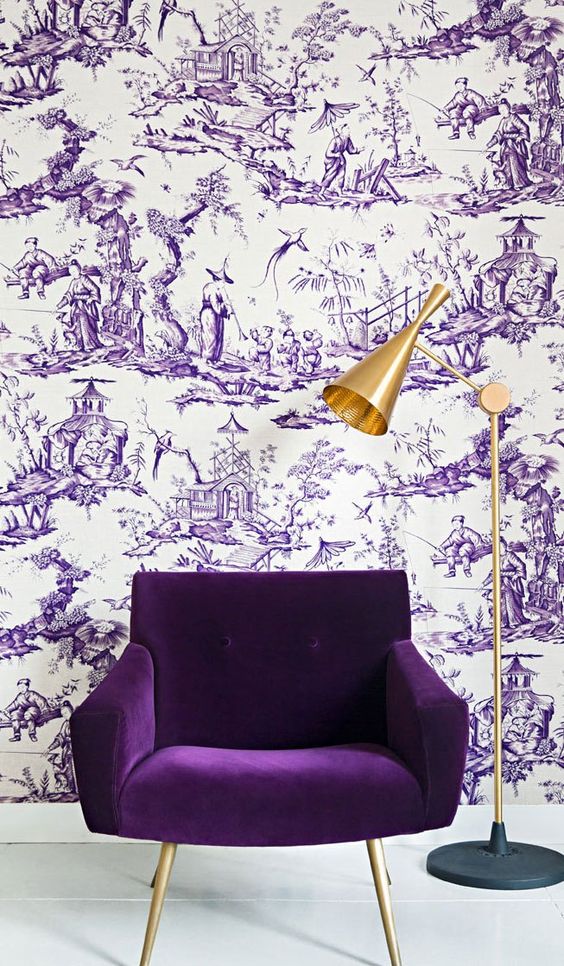
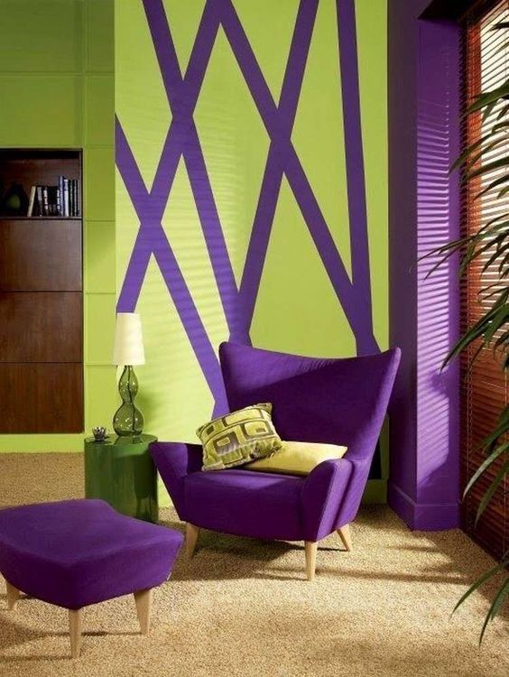
The inspiration behind choosing ultraviolet as Pantone Colour of the Year 2018 was the colour’s evocative tone of spirituality and mysticism coupled with nonconformity and unconventionality. It is exceptionally versatile as it has both cool and warm temperaments and can be used as a stand-alone colour or paired with as a complementary colour. Despite being a potently distinctive colour, ultraviolet is surprisingly easy to work with, which serves as a boon to designers across fields of print and textile design and professional experts in fields of fashion and art.
Ultraviolet is a complex colour in terms of the emotions and feelings it produces in us. It has a deep spiritual tone it which shows its connection to the infinite cosmos. At the same time, it is also the hue most strongly associated in terms of creative expression and nonconformity which makes it characteristically influential. Ultraviolet is not only reminiscent of seeking a higher self in terms of spirituality but it is also about expanding our innovative and creative faculties in terms of art and awareness. It is a colour that paves the way for what has been and for what is yet to come.
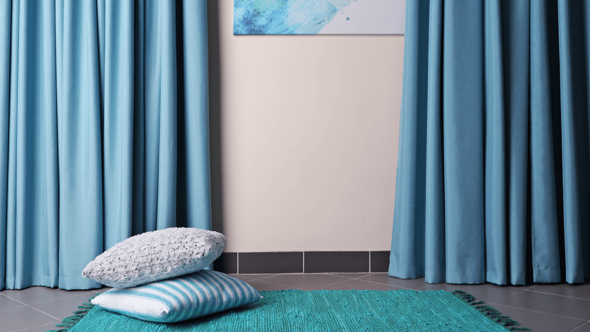
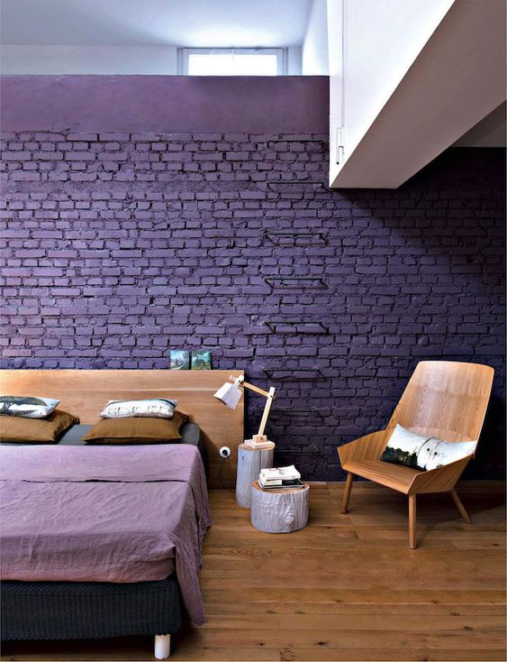
Design of the room includes the lighting of the bedroom and the furniture of the bedroom too. Lighting should be such that the frame of the light should depict the kind of natural frame which means that the holders of the light should be in shape of natural wood or the light coming from a bush of the leaves. Furniture of the bedroom should be of wood if not the colour and the shape of the furniture should be in the form of wood which would depict the natural beauty of the furniture in the bedroom.
Image Source : Pinterest